





Native
We start by deeply understanding the languages, cultures, and realities of the communities we serve.
Namu — visual identity
Namu is an African AI research and technology company building speech-native models, datasets, and products that make technology accessible through natural conversation in every language and every community.

Namu's identity should feel precise, grounded, and human. It carries the seriousness of infrastructure and the warmth of community: technology that does not ask people to become someone else before they can participate.
We start by deeply understanding the languages, cultures, and realities of the communities we serve.
Language should never be a barrier to knowledge, opportunity, or participation.
We succeed when communities, partners, and team members grow alongside us.
The Namu wordmark is the primary expression of the brand. Use the full wordmark for most communications. Use the icon only when space is limited, or when Namu is already clearly identified.




The logo should never feel crowded. Keep a generous margin around the wordmark and avoid placing it inside busy visual areas.
The marks are drawn once and used as drawn. Everything below is a real failure we would rather not see in the wild.
EST. 2026 NIGER namu
namu
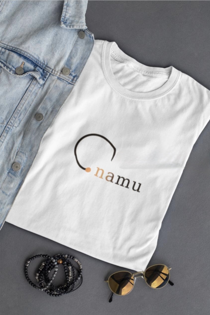
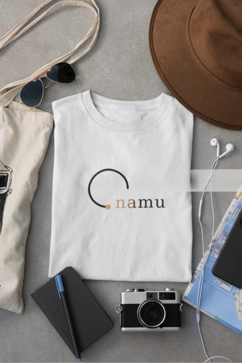
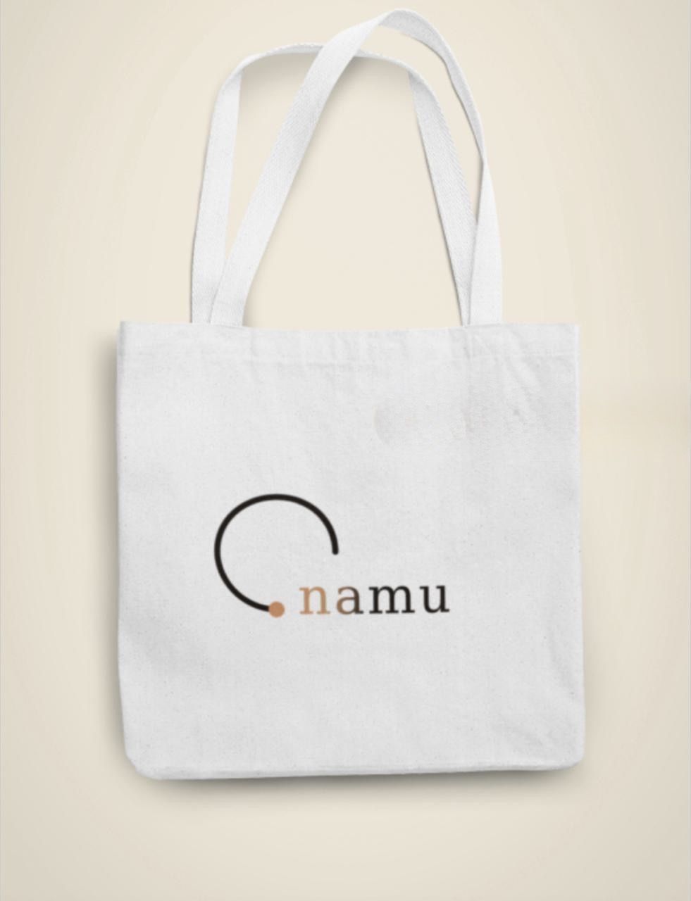
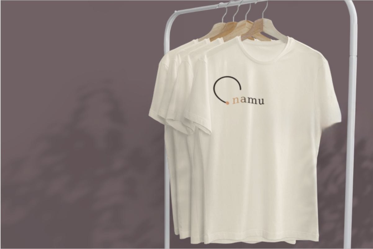
Namu's palette is designed for editorial clarity and cultural warmth. Harmattan cream and Ink carry the system; Sahel, Kola, Forest, and Dry Clay add emphasis and depth.
Click a swatch to copy its hex.
Use the display serif for high-emphasis brand moments and the mono for utility, interface labels, and documentation.
Every language, every community.
Namu builds speech-native models, datasets, and products that enable people to access technology through natural conversation in their own language. The typography should feel precise enough for research and warm enough for people.
MODEL CARD / DATASET / EVALUATION / RELEASE NOTES
Namu's voice is grounded, direct, and inclusive. We explain infrastructure through human access, and we avoid hype that makes the mission feel temporary.
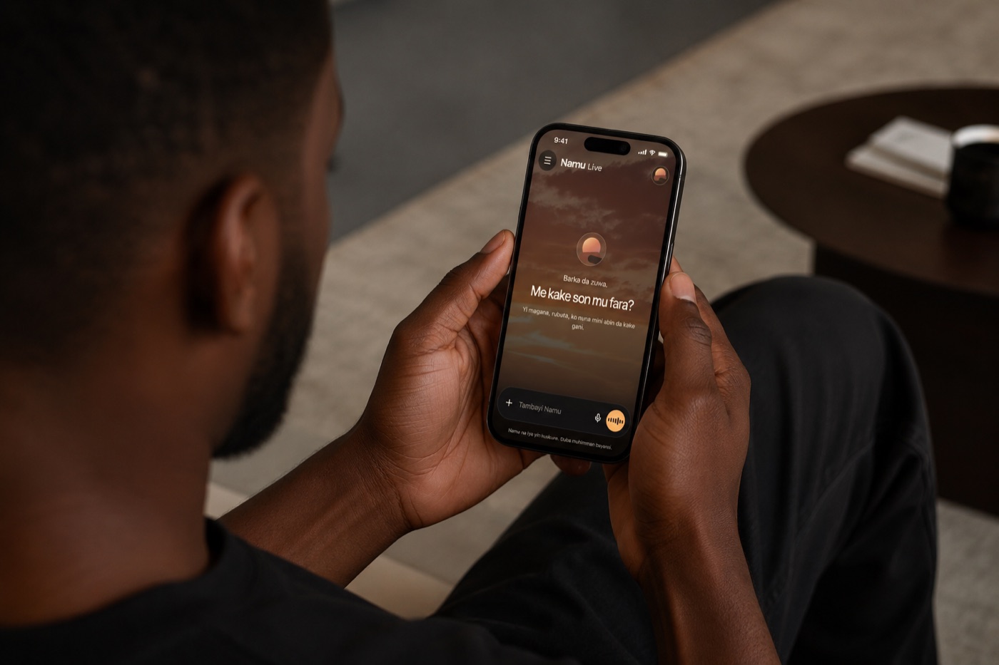
Namu applications should feel calm, legible, and trustworthy. The brand should support the content rather than overpowering it.
Models, datasets, and products designed around the way people naturally communicate.
A quiet page system for reports, briefs, and partner documents.
Use high-contrast moments for pitches, talks, and strategic storytelling.
When Namu appears with another organization, keep the relationship clear. Do not imply endorsement, sponsorship, or product partnership unless formally approved.
Use “in partnership with Namu” only for active collaborations. Use “built with Namu technology” only when the integration has been reviewed and approved.
Partner lockups should use equal visual weight, generous spacing, and neutral alignment. Do not place Namu inside another brand's shape or color system.
The term “Marks” includes anything we use to identify our goods or services, including our names, logos, icons, wordmarks, visual identity, and design elements. By using Namu's Marks, you agree that Namu owns them and that any goodwill generated by your use benefits Namu.
Permission to use our Marks is limited in the following ways:
Please make sure your product, communication, dataset, model, application, or public material describes Namu accurately and does not confuse people about your relationship with Namu. Do not use Namu's name, logo, Blossom, wordmark, or other Marks in your app, product, developer, organization, or company name unless you have written permission from Namu.
For legal inquiries, please contact legal@namuai.org.
For everything else — including permission requests for the use of our logos, questions about these guidelines, or communications that go beyond the cases outlined above — please contact legal@namuai.org.